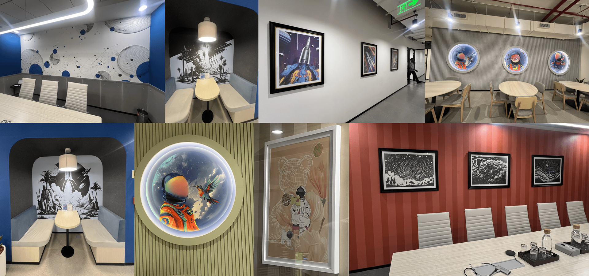
The Brief: Atomicwork approached me to design artwork for their new office spaces at Cowrks, Bengaluru, with the larger coworking theme of “Space and Beyond” as the backdrop. The challenge was to create a distinct visual identity that felt unmistakably Atomicwork — one that reflects their journey from an early-stage startup to a growing enterprise, while inspiring teams day-to-day. The brief emphasized three guiding pillars: inspiration, innovation, and momentum. Visually, the direction leaned toward bold digital surrealism — modern, energetic, and slightly playful — with subtle nods to AI, technology, and collaboration. My process involved translating these abstract themes into adaptable artwork concepts that could work across walls, glass partitions, and future brand assets, ensuring the space feels both futuristic and warmly human.
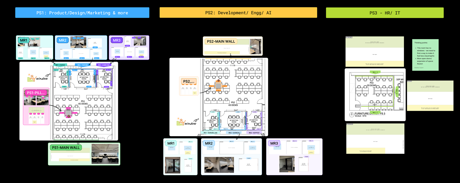
Step 1: Floor plan, Room breakdown, Wall-mapping & Color coding
Step 2: Site visit and recce to study Cowrks Offices outer-space aesthetic
At my first site visit I was able to spend time with few members of the team and get insights into the company's journey thus far. Inside jokes served as easter eggs across the artworks and communication here helped me visualise what the growth journey had been for them.
At my second I had sit-downs with the company CEO & the CPO to further understand what the company's vision for the future was, how they wanted to mould and shift the space to symbolize this for their team & for their brand as a whole. I learned that the company had been named after the Atomic Habits book by James Clear & that their office pet Dobby held a special place on the 404 page of their website, I learned that ATOMIC stood for Agency - Taste - Ownership - Mastery - Impatience - Customer obsession. Such minute insights were woven into the story I conceptualized and illustrated for this space.
At my second I had sit-downs with the company CEO & the CPO to further understand what the company's vision for the future was, how they wanted to mould and shift the space to symbolize this for their team & for their brand as a whole. I learned that the company had been named after the Atomic Habits book by James Clear & that their office pet Dobby held a special place on the 404 page of their website, I learned that ATOMIC stood for Agency - Taste - Ownership - Mastery - Impatience - Customer obsession. Such minute insights were woven into the story I conceptualized and illustrated for this space.
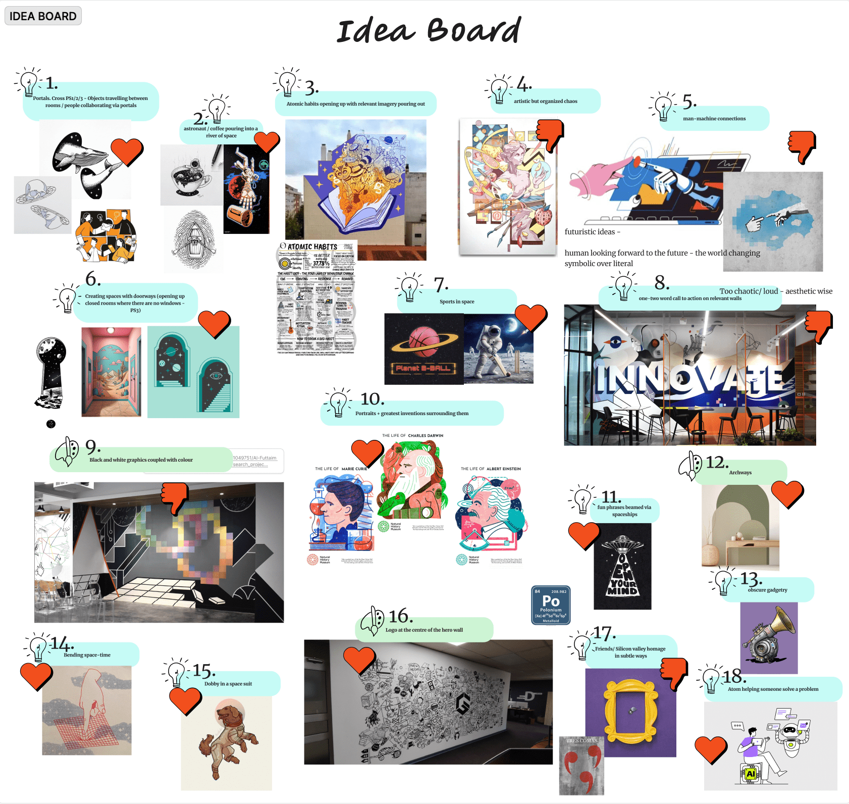
Step 3: Idea compilation + sit down with the team to short list concepts
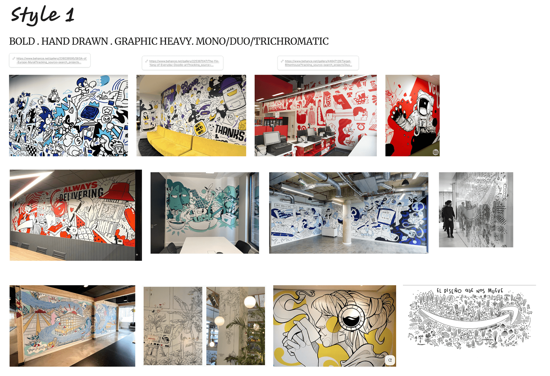
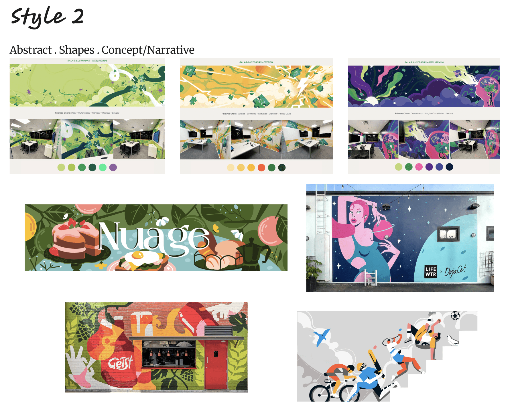
With initial discussions as a guiding light I had shortlisted 2 stylistic approaches as depicted above. The team was more in favour Style 2 (abstract/ flat shapes) and the CPO requested a more futuristic style of expression seen on the blogs of the Perplexity website. Hence the moodboard below was approved and work commenced.
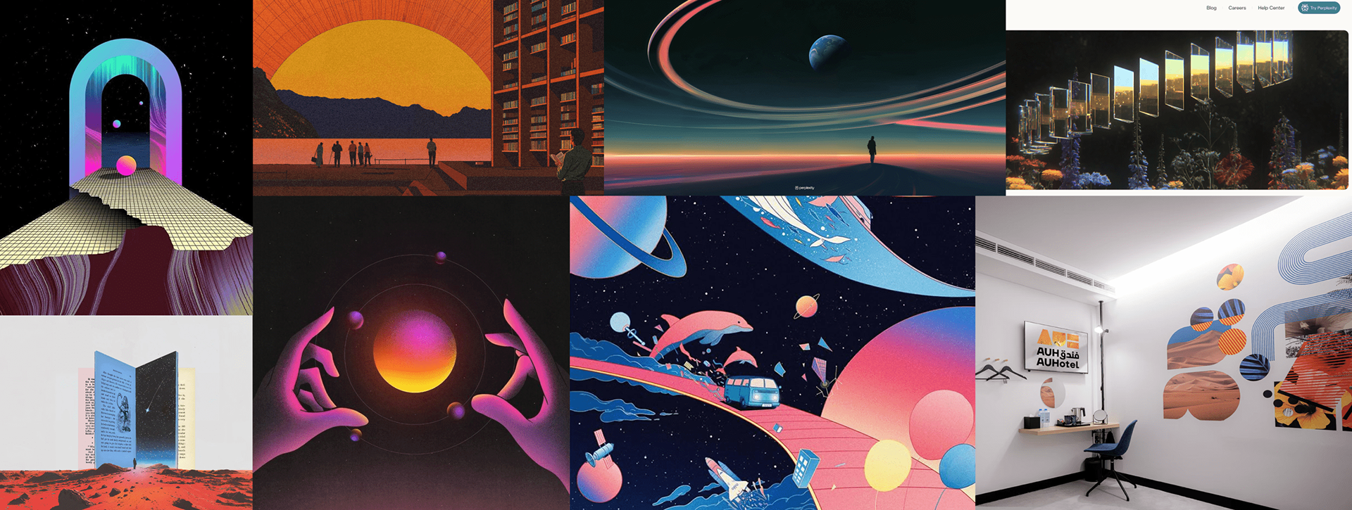
Step 5: Final approved stylistic moodboard
I started working with the Curie room first, finalizing the digital vectorized aesthetic filled with glows & gradients. Once the style and colours were approved, the rest of the artworks flowed smoothly curating a space that flowed seamlessly from one room to the next.
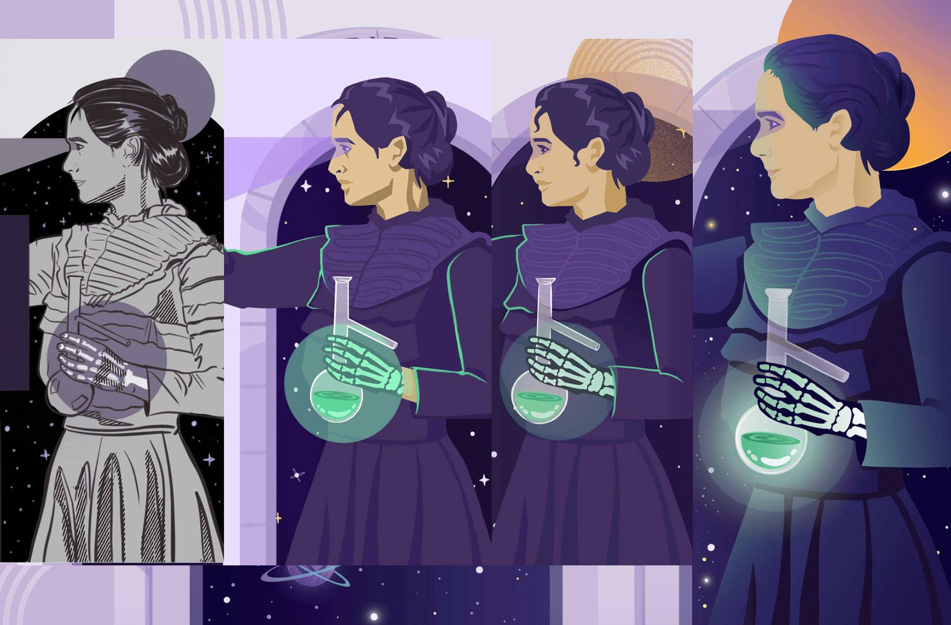
Step 6: Style tweaking with the Curie artwork
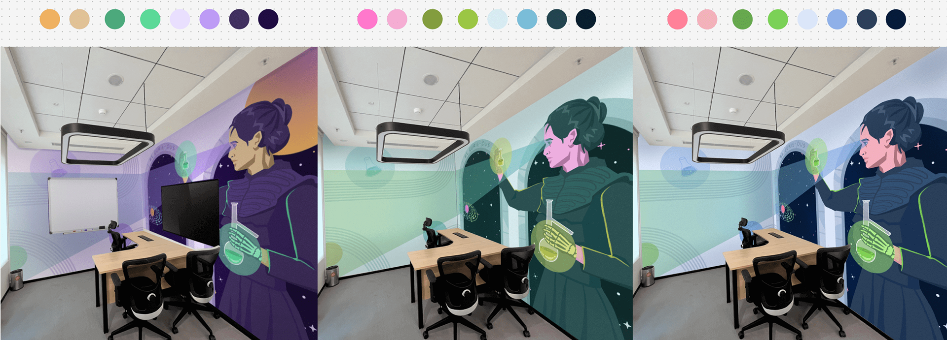
Colour explorations for Curie